Data similarity
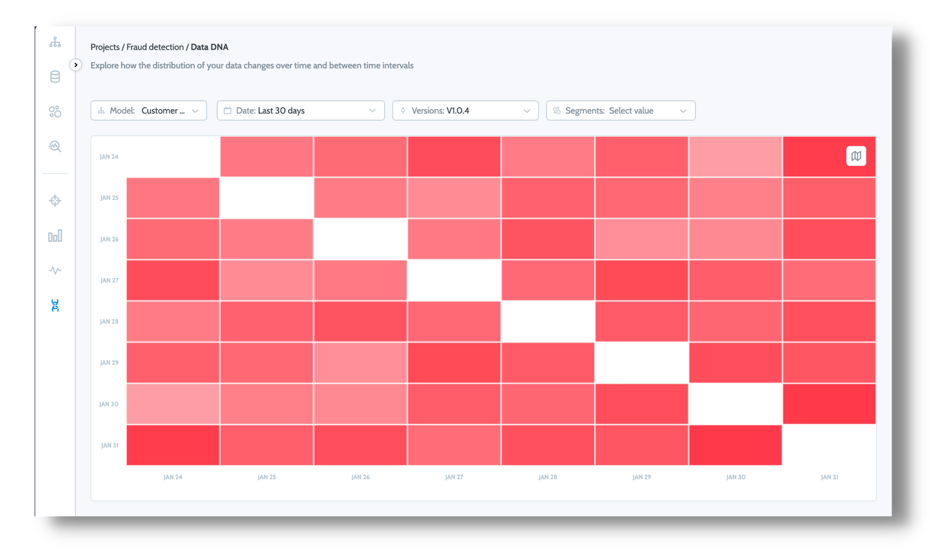
The Data DNA feature allows you to visualize data that can help reveal patterns.

In the above example, the rows and columns represent dates. The different cell colors represent the changes in distribution between the dates in the row and in the column. The darker the color, the greater the change in distribution. The lighter the cell color, the more constant the distribution remains over the period between the two dates. White means the values are entirely identical.
The change in distribution change represents the average distribution of the different features measured between those dates.
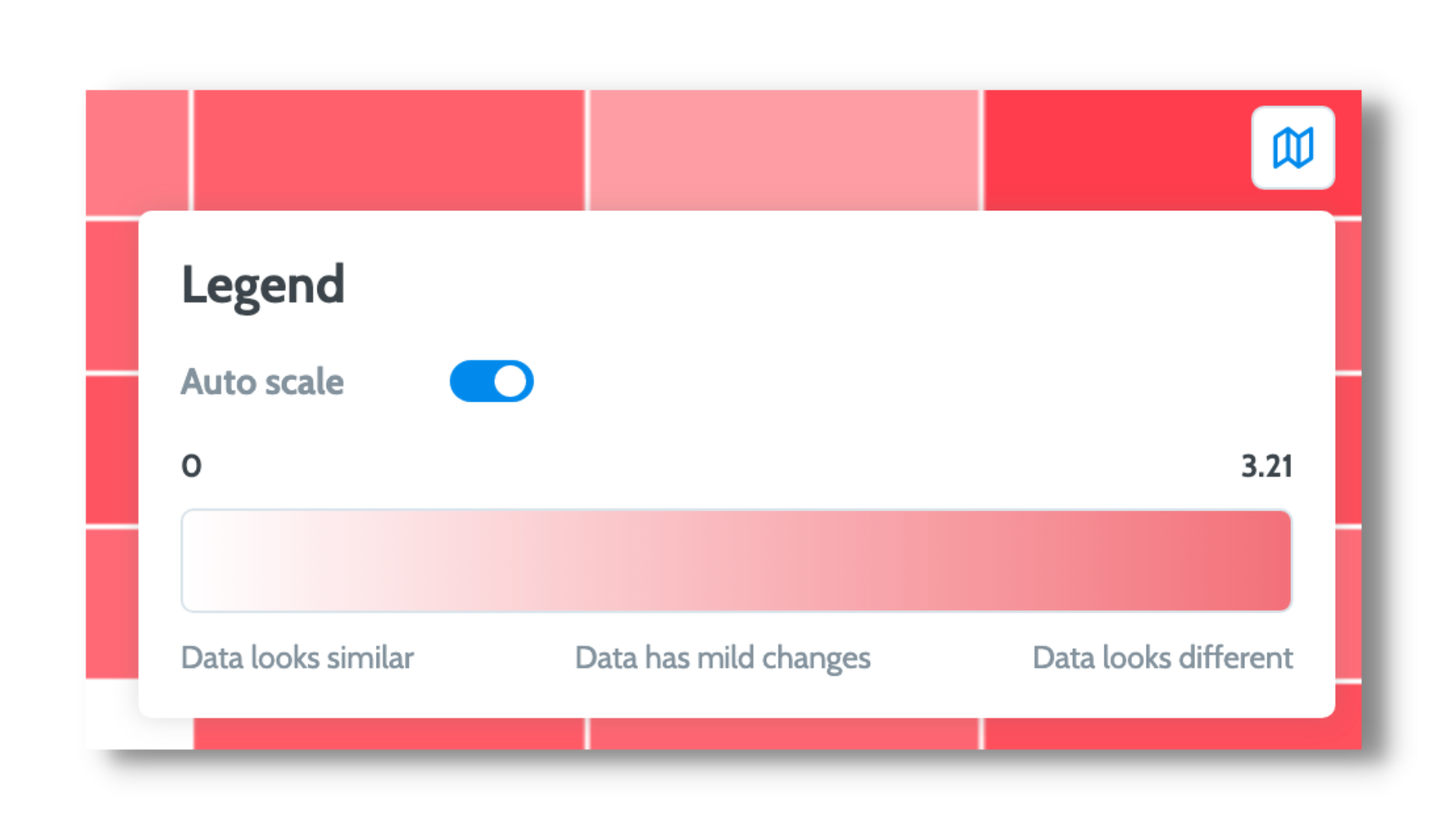
Auto scale - - Autoscale automatically adjusts the cell shading so the darkest red color is used to represent the maximal change in feature value distribution. Without autoscale, the visualization will use a constant scale of shading that goes from 0/white (identical) to 100/darkest red, which makes it difficult to see small changes in distribution values. For example, Autoscale is a practical solution for examining differences in distributions when the changes are small, say between 0 and 3.21.

Drill down
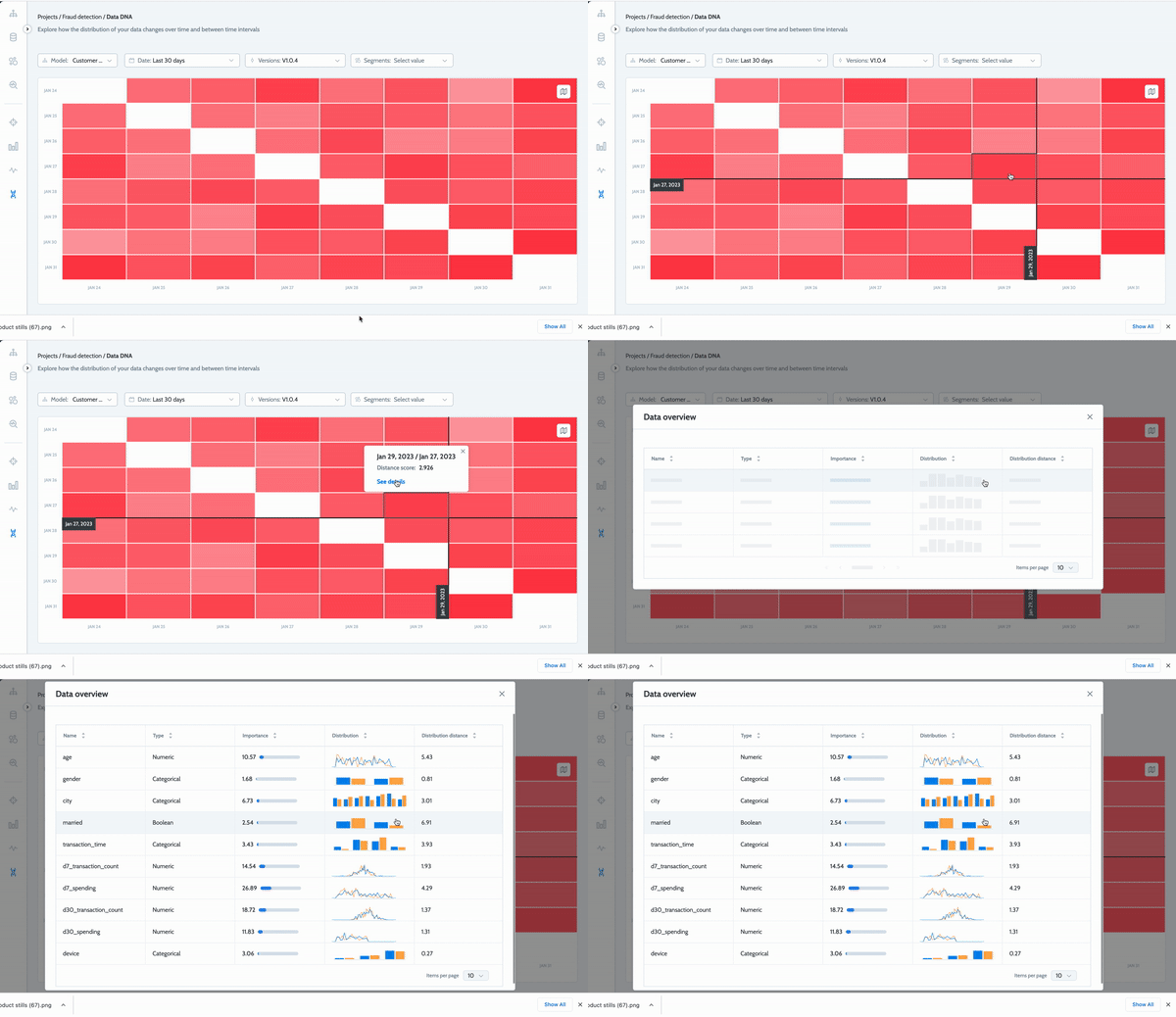
You can click an individual cell to see how the distribution changes for each feature during the time period from one date to the next.

How can I use it?
Data DNA visualization allows you to find patterns within your data. For example, you might recognize a specific period as a holiday season and decide to retrain your model without it. The visualization also makes it easier to see seasonality. For example, you might notice a difference in feature values on weekends, as opposed to the middle of the week, and decide to split the two data collections into different models.
By examining the Data DNA, you can view patterns that will help you fine-tune your retraining strategy based on how the model behaves on different days.
You can read more about continuous training strategy in this article
Updated over 2 years ago
